We love our newest BIG alphabet in the shop: our Navy Acetate Alphabet! This large alpha in a trendy color is making a BIG impact on the projects by our design team. Let’s take a look at 5 different ways you can incorporate these alphas into your next project:

- Pair them with a stamp, like Katarina did here using our Grateful Stamp to create the perfect title! The mix of font size and type creates a truly eye-catching title!
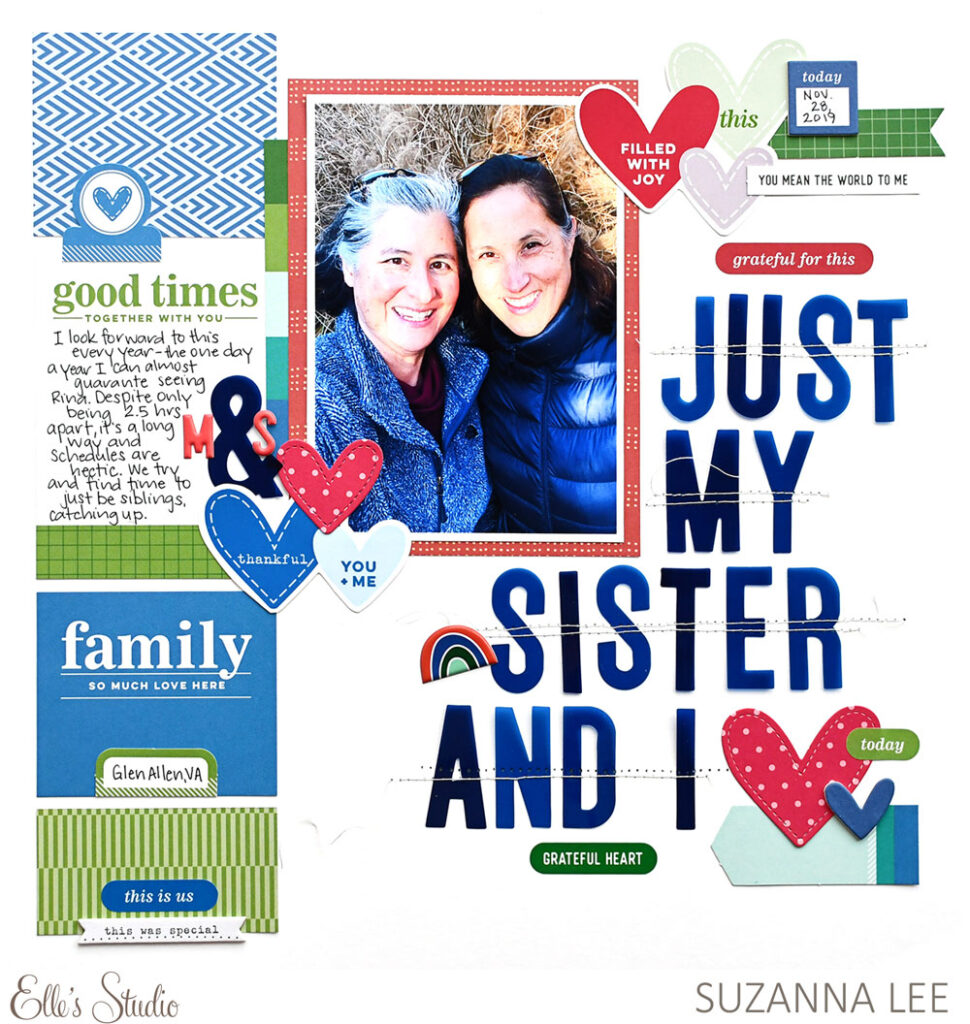
2. Fill up the white space on your page! Suzanna used our acetate alphabet here to create her title in a BIG way—taking up most of the right side of her page. Her title really sets up the story of her page, and makes us want to read her journaling to find out about this special relationship.
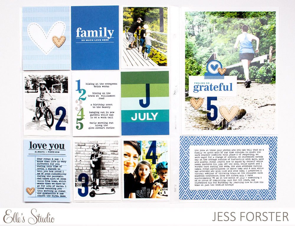
3. Add only single letters or numbers for a graphic look, as Jess did in her pockets! We love the bold pop of navy it adds the the negative spaces in her photos, and corresponds to her numbered journaling that she added on one of our September Kit tags.
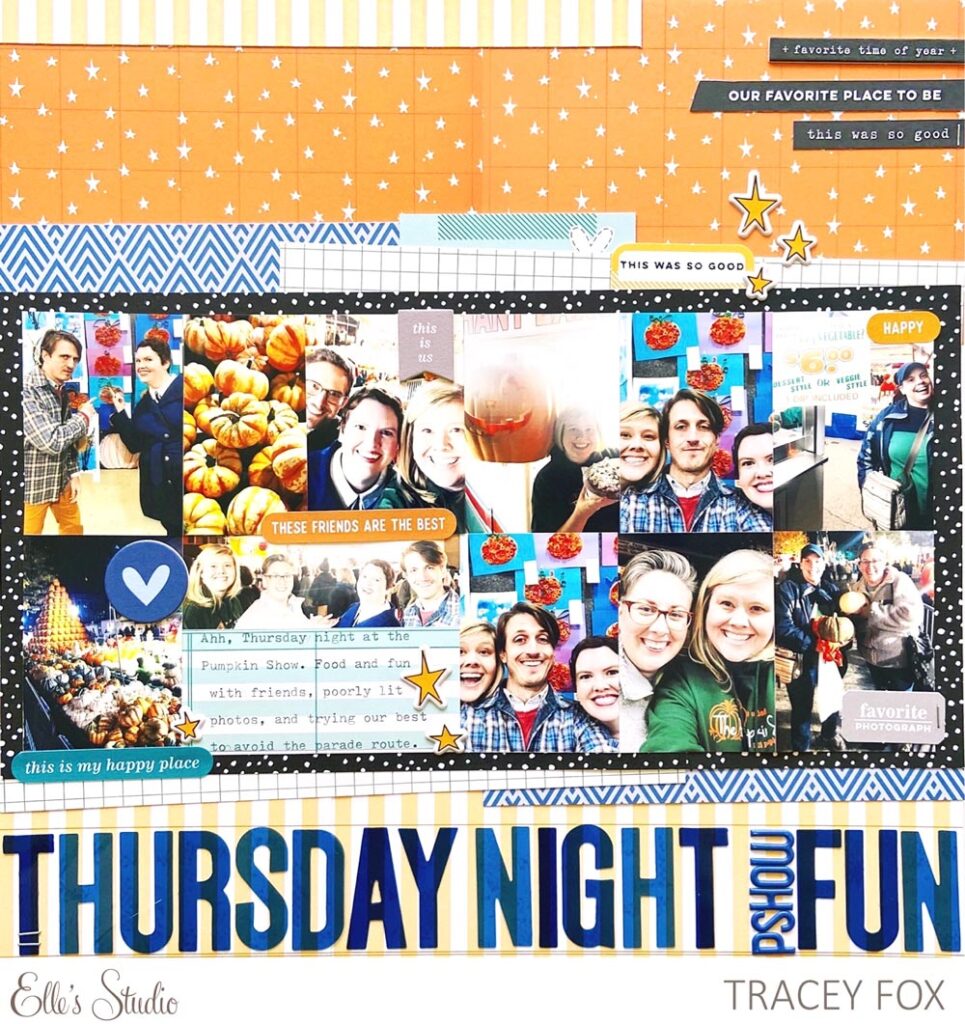
4. Ground a large element by stretching your Navy Acetate Alphabet horizontally across the page, as Tracey did on this layout! Her bold title creates a shelf for her large photo and patterned paper block above, helping ground it to the overall page.
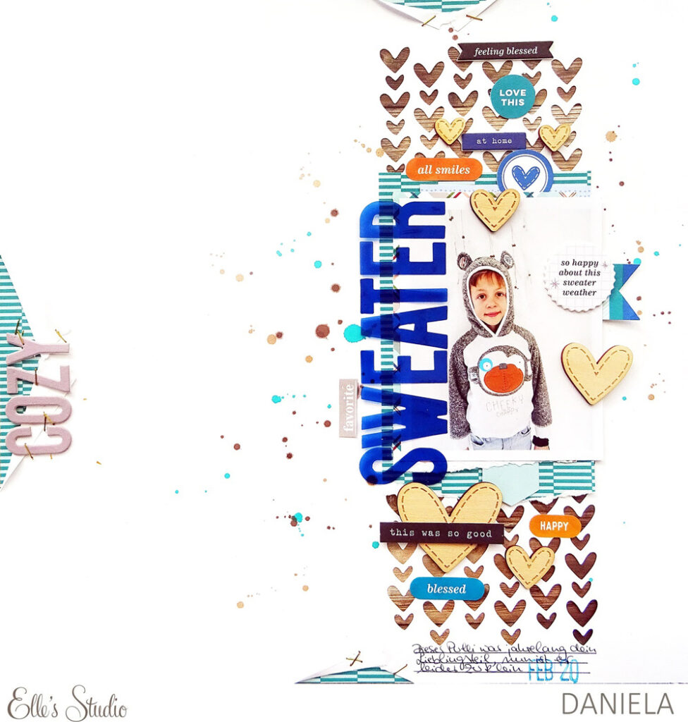
5. Turn your title, as Daniela did here, to match the predominant orientation of your project. Because the elements on Daniela’s page were designed on a vertical column, it made perfect sense that her title followed suit! Don’t assume that a title always has to be on a horizontal axis!
We hope you love our new Navy Acetate Alphabet as much as we do! Share your ideas on how you can incorporate it into your projects by posting on Instagram using the hashtag #EllesStudio, and in our Elle’s Studio Facebook Group! We can’t wait to hear YOUR ideas!